
The Engage Mobilize platform can drive significant operational efficiency and back-office productivity improvements by replacing legacy paper-based processes and workflows with streamlined digital processes. However, gigabytes of data streaming in from the field creates a challenge for interpreting, analyzing and using all that data.
We created the Engage Mobilize Power BI dashboard to bring organization and meaning to digital workflows. The Power BI dashboard is a powerful tool that brings operational data to life and facilitates informed decision-making.
This article covers how Power BI works and how it can help you transform the way you visualize and take command of field operations
Streamlining Workflows: Going Digital for Productivity
The Engage Mobilize E-Ticketing platform replaces manual paper tickets with a seamless digital electronic ticketing system. Transitioning to digital processes can substantially boost productivity and efficiency by eliminating the inefficiencies tied to manual data entry, routing and approvals. The Power BI dashboard takes things to the next level, allowing operations, engineering and finance professionals to interact easily with the data and collaborate with service providers.

The Power of Power BI: A Quick Overview
The Power BI dashboard is a dynamic tool that turns raw operational data into actionable insights. Power BI gives you the ability to generate reports, analyze trends and gain transparency over your field operations from your desktop, laptop, or mobile device on-site. Power BI offers decision-makers a comprehensive tool to track the trends & KPIs of the raw data through visually engaging charts, graphs and dashboards.
Unveiling Datasets and Analysis
The Engage Mobilize Power BI dashboard is fueled by datasets captured in the E-Ticketing platform. This raw data forms the foundation for analysis, where key performance indicators (KPIs) are generated and visualized.
The visual display layer – encompassing interactive charts, graphs and reports – brings the data to life and simplifies complex information for easy comprehension. The result is a dynamic dashboard offering a real-time data summary, enabling operators to assess and optimize their activities on the fly.
Examples of Taking Command with the Power BI Dashboard
In the following section, we will show six illustrative instances of visual analysis within the Power BI dashboard.
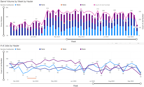
1. The Water Ticket Summary Dashboard gives you a complete overview of produced water hauling by service provider. This information helps you get the big picture view on which water haulers are doing the most work, and which ones are performing the best.
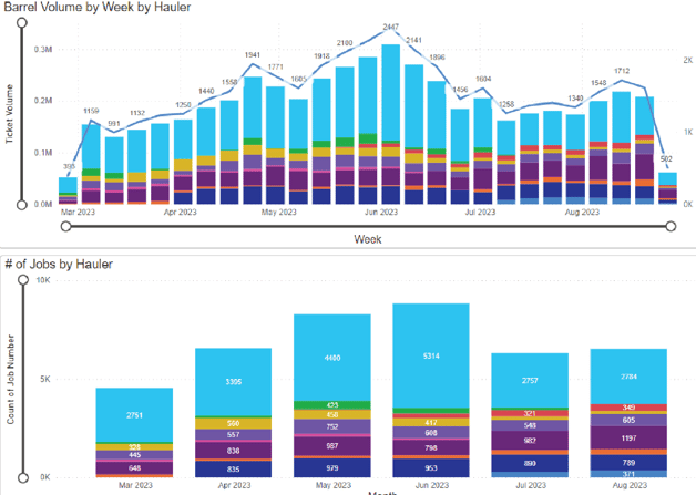
2. The Ticket Summary - Water Dashboard provides insight into produced water hauling ticket volumes, which service providers are the most active and what facilities are using the most services.
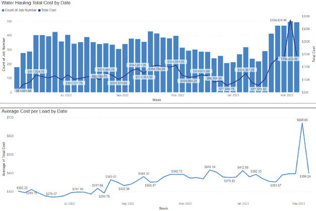
3. The Lease Operating Expense (LOE) Dashboard helps you stay up to date with real time information on water hauling expense, both total and per load. This information helps you identify trends visually before the production accounting books close and spot potential issues before they turn into problems. Add additional data to enhance the value of the analysis. In this case, consider viewing daily activity by job type.
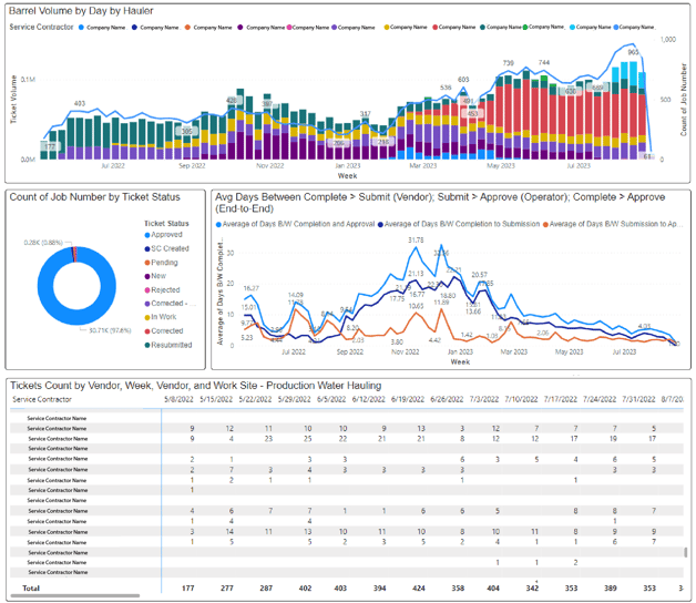
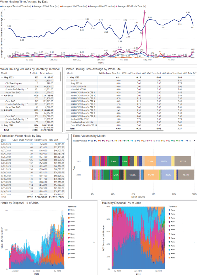
4. The Water Hauling Dashboard provides insight into service provider productivity, disposal facility productivity, costs, facility utilization and other key performance indicators.
5. The Crude Ticket Summary Dashboard provides a visual summary of crude hauling jobs, from oil volumes hauled from each hauler and facility.
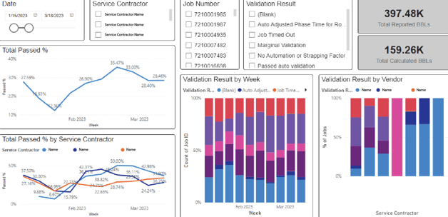
6. The Ticket Validation Dashboard gives you detailed information on ticket validation status by service provider, job type and work site. This report can help you identify potential problem areas and opportunities for increasing auto approvals, saving you time and driving efficiency improvements.

Features that Empower
Power BI boasts a range of features that empower users to harness the full potential of their operational data:
- Real-time Data Visualization: Stay on top of operations by accessing real-time insights and updates.
- Intuitive, User-Friendly Interface: The intuitive interface makes data exploration a breeze, even for non-technical users. Dive deep into your data, uncover trends, and identify opportunities with ease.
- Customizable Visuals: Tailor your visuals to match your business's unique requirements and branding.
- Cloud-Based and Scalable: Power BI's cloud-based architecture ensures scalability, keeping up with your growing data needs.
- Seamless Data Integration: Connect to various data sources effortlessly for a holistic view of operations.
- Secure Data Sharing: Share insights with stakeholders securely, fostering collaboration and informed decision-making.
- Automated and ML Insights: Leverage automated insights and gain deeper understanding.
- Mobile Accessibility: Monitor operations on the go, with a responsive design optimized for mobile devices.

Reaping the Benefits
Benefits of the Engage Mobilize Power BI dashboard include:
- Improved Decision Making: Power BI's visualizations empower decision-makers with the information needed to work smarter.
- Trend Identification: Identify trends and patterns as they emerge, facilitating proactive strategies.
- Streamlined Performance Tracking: Ditch cumbersome spreadsheets and embrace real-time, data-driven tracking.
- Geospatial Data Visualization: Map your operational data to better understand geographical trends and insights.
- Predictive Analytics: Leverage historical data for predictive insights that guide future actions.
- Scalable and Cost-Effective: Power BI's cloud architecture ensures scalability without a hefty price tag.
A Transparent Future: Increased Visibility with Power BI
The Engage Mobilize Power BI dashboard provides new levels of operational transparency and financial visibility and is a game-changer for managing and optimizing workflows. It is a tool for delivering meaningful information to the right people so they can monitor, analyze and optimize field operations in real time, substantially increasing efficiency, productivity, teamwork and making the organization more responsive to changing conditions.
With the Power BI dashboard, businesses can wave goodbye to guesswork and inefficiencies, replacing them with data-backed decisions and streamlined processes.
Contact us today at (720) 575-6695 or Sales@engage-m.com to learn how the Power BI dashboard can help you monitor, analyze, manage and optimize operations to achieve new levels of efficiency and productivity.
Share this

Five Critical Best Practices for Data Governance

Integrating Field Operations Software: Unifying Your Systems into One Integrated Solution